Make Every Day Spotify Wrapped Day
Spotify Wrapped Day is a super fun day on the internet. You can find out how much time you spent looping something embarrassing, see how long your friends spent listening, and read touching profiles of folks who listened to something more than 80% of the year.
But Spotify Wrapped Day only comes once a year, and I wanted to play more with my underlying listening data. So, I requested my data from Spotify! You can do the same by following the instructions here. Getting you the data can take Spotify up to 30 days, though I got mine within 2.
You can also use the Spotify API if you want the data faster. I wanted to start with a more approachable version since I know APIs can be intimidating for some folks, and I’ll be using the API with R more in future posts.
Load Packages
First, we’ll start by loading packages we need to tidy and visualize our Spotify data.
Import and Tidy Data
Then we need to import, tidy, and add some info to my Spotify data file. We’re going to look at the StreamingHistory file today, and the documentation for what each variable means check here.
If you’re not familiar with JSON format data, you can learn more about it here. Using the jsonlite R package we easily convert the JSON data into a data frame using the “fromJSON” function, and the clean_names() function from the janitor package makes the variable names more user friendly.
From there, we can use functions from the lubridate package to get specific dates + whether they were weekdays or weekends. We then use the skim function to get a sense of what our data looks like.
listen_data <- fromJSON("StreamingHistory0.json") %>%
  clean_names() %>%
  mutate(end_time = with_tz(end_time, tzone = "America/New_York"),
         date = date(end_time),
         day_week_temp = wday(end_time),
         weekend = factor(case_when(
           day_week_temp == 6 | day_week_temp == 7 ~ "Weekend",
           day_week_temp == 1 | day_week_temp == 2 | day_week_temp == 3 | day_week_temp == 4 | day_week_temp == 5 ~ "Weekday",
           TRUE ~ NA_character_
         ))) %>%
  filter(date >= "2021-01-01" & date <= "2021-12-31") %>%
  arrange(desc(date)) %>%
  select(-day_week_temp)

skim(listen_data)
| Name | listen_data |
| Number of rows | 7325 |
| Number of columns | 6 |
| _______________________ | |
| Column type frequency: | |
| character | 2 |
| Date | 1 |
| factor | 1 |
| numeric | 1 |
| POSIXct | 1 |
| ________________________ | |
| Group variables | None |
Variable type: character
| skim_variable | n_missing | complete_rate | min | max | empty | n_unique | whitespace |
|---|---|---|---|---|---|---|---|
| artist_name | 0 | 1 | 3 | 87 | 0 | 877 | 0 |
| track_name | 0 | 1 | 2 | 144 | 0 | 1818 | 0 |
Variable type: Date
| skim_variable | n_missing | complete_rate | min | max | median | n_unique |
|---|---|---|---|---|---|---|
| date | 0 | 1 | 2021-01-01 | 2021-12-31 | 2021-05-24 | 344 |
Variable type: factor
| skim_variable | n_missing | complete_rate | ordered | n_unique | top_counts |
|---|---|---|---|---|---|
| weekend | 0 | 1 | FALSE | 2 | Wee: 5334, Wee: 1991 |
Variable type: numeric
| skim_variable | n_missing | complete_rate | mean | sd | p0 | p25 | p50 | p75 | p100 | hist |
|---|---|---|---|---|---|---|---|---|---|---|
| ms_played | 0 | 1 | 469721 | 992756.3 | 0 | 140533 | 195747 | 240893 | 13995781 | ▇▁▁▁▁ |
Variable type: POSIXct
| skim_variable | n_missing | complete_rate | min | max | median | n_unique |
|---|---|---|---|---|---|---|
| end_time | 0 | 1 | 2021-01-01 01:51:00 | 2021-12-31 23:56:00 | 2021-05-24 21:11:00 | 6672 |
Visualize Listening Over Time
Spotify Wrapped focuses on totals throughout the year, and I was curious about what my listening habits looked like at different times of year. I created this and all the other visualizations in this plot using ggplot2. The custom font via the showtext package made a huge difference, and I highly recommend using the color schemes from the viridis palettes. They look cool and they’re pre-assessed for accessibility.
font_add_google(name = "Oswald",
                family = "oswald")

showtext::showtext_auto()

listen_data %>%
  group_by(date) %>%
  mutate(sum_ms_listen = sum(ms_played),
    mins_listen = ((sum_ms_listen / 1000)/60)) %>%
  ggplot(aes(x = date, y = mins_listen, color = mins_listen)) +
  geom_line() +
  scale_color_viridis_c(option = "plasma") +
  theme_dark() +
  scale_x_date(limits = as.Date(c("2021-01-01","2021-12-31")),
               expand = c(0,0),
               date_breaks = "1 month",
               date_labels = "%B") +
  theme(plot.background = element_rect(fill = "black"),
        legend.position = "none",
        text = element_text(family = "oswald", color = "white", size = 15),
        panel.background = element_rect(fill = "black"),
        axis.text = element_text(color = "white"),
        axis.text.x = element_text(angle = 25),
        axis.text.y = element_text(size = 15, hjust = 1.2),
        plot.title.position = "plot") +
  labs(x = "", y = "Minutes Listened",
       title = "By Far My Heaviest Spotify Listening Happened on August 28, 2021")
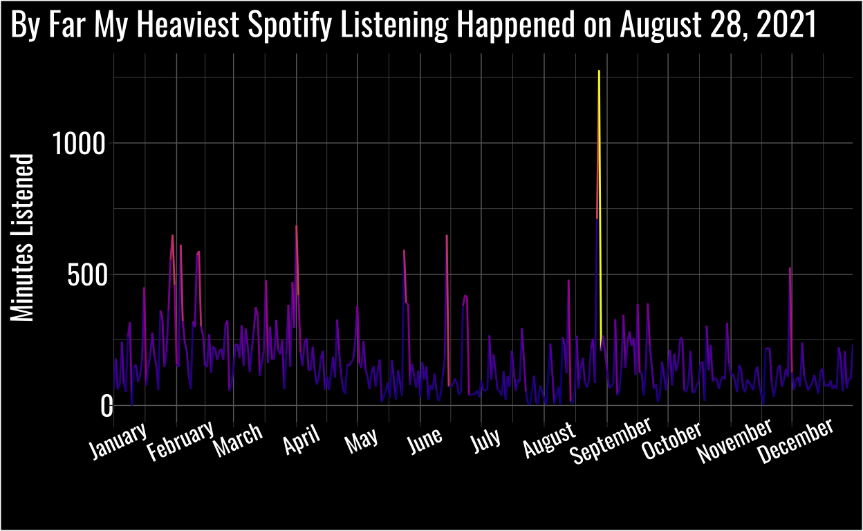
What on Earth Happened on August 28, 2021?
I was working on a huge task I needed to finish before I left to get married the following week!
I had an intuition of what I was listening to, but before I assumed too much I decided to visualize the data for that day.
listen_data %>%
  group_by(date) %>%
  mutate(sum_ms_listen = sum(ms_played),
    mins_listen = ((sum_ms_listen / 1000)/60)) %>%
  arrange(desc(mins_listen)) %>%
  filter(date == "2021-08-28") %>%
  group_by(track_name) %>%
  tally(ms_played) %>%
  mutate(mins_listen = as.integer(((n / 1000)/60)),
         track_name = as.factor(track_name)) %>%
  select(-n) %>%
  ggplot(aes(fct_reorder(track_name, mins_listen), fill = track_name)) +
  scale_fill_viridis_d(option = "plasma") +
  geom_col(aes(y = mins_listen), alpha = 0.8) +
  geom_text(aes(y = mins_listen, label = mins_listen), hjust = -0.2, family = "oswald", color = "white", size = 5) +
  scale_y_continuous(labels = comma, limits = c(0, 1500)) +
  theme_dark() +
  coord_flip() +
  theme(axis.text.x = element_blank(),
        plot.background = element_rect(fill = "black"),
        legend.position = "none",
        text = element_text(family = "oswald", color = "white", size = 15),
        panel.background = element_rect(fill = "black"),
        axis.text = element_text(color = "white"),
        plot.title = element_text(hjust = 0.5),
        plot.title.position = "plot") +
  labs(x = "", y = "Minutes Listened", title = "Luca Stricagnoli\'s Cover of Sweet Child O' Mine Ruled That Day")
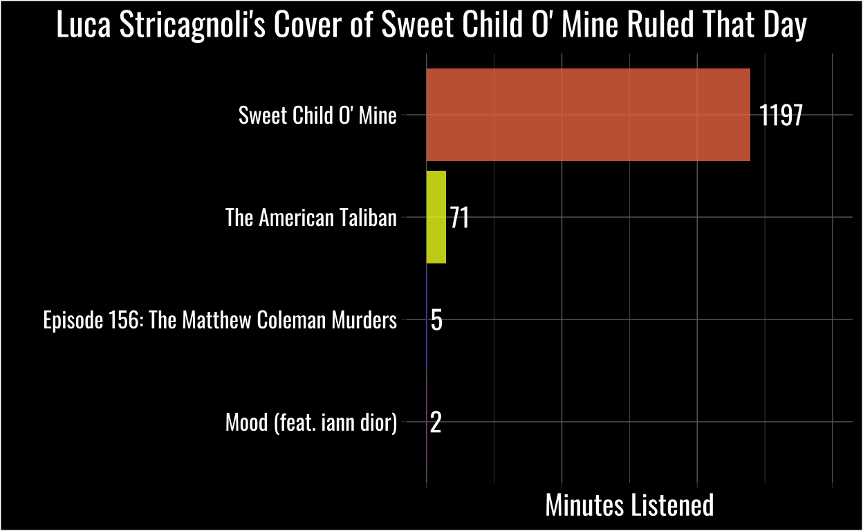
As I’d suspected, I’d listened to an obscene amount of instrumental acoustic guitar with a You’re Wrong About episode sprinkled in for flavor.
Before you laugh too much (ok fair, after you finish laughing) I recommend you check out this video. I don’t know if any song is “listen to nearly 1,200 minutes of it in the same day” good, but if anything is…
listen_data %>%
  group_by(date) %>%
  mutate(sum_ms_listen = sum(ms_played),
    mins_listen = ((sum_ms_listen / 1000)/60)) %>%
  arrange(desc(mins_listen)) %>%
  filter(date == "2021-08-28") %>%
  count(track_name)
# A tibble: 4 × 3
# Groups:   date [1]
  date       track_name                                   n
  <date>     <chr>                                    <int>
1 2021-08-28 Episode 156: The Matthew Coleman Murders     1
2 2021-08-28 Mood (feat. iann dior)                       1
3 2021-08-28 Sweet Child O' Mine                        182
4 2021-08-28 The American Taliban                         1
Still, even I can admit listening to the same track 182 times in one day might be a bit excessive. In fact, I must have accidentally left that song looping in my slowly dying headphones, because I definitely didn’t work 20+ hours that day!
What Did My Listening Look Like on Weekdays vs. Weekends?
Then I got curious, with this huge outlier happening on a Saturday, what my listening patterns looked like on weekdays vs. weekends.
I visualized the distributions and raw data of my time spent listening each day using a raincloud plot.
listen_data %>%
  group_by(date) %>%
  mutate(sum_ms_listen = sum(ms_played),
    mins_listen = ((sum_ms_listen / 1000)/60)) %>%
  distinct(mins_listen, .keep_all = TRUE) %>%
  ggplot(aes(x = mins_listen, y = weekend, color = weekend, fill = weekend)) +
  geom_density_ridges(alpha = 0.5,
                      jittered_points = TRUE,
                      position = "raincloud") +
  scale_color_viridis_d(option = "plasma") +
  scale_fill_viridis_d(option = "plasma") +
  theme_dark() +
  theme(plot.background = element_rect(fill = "black"),
        legend.position = "none",
        text = element_text(family = "oswald", color = "white", size = 15),
        panel.background = element_rect(fill = "black"),
        axis.text = element_text(color = "white"),
        axis.text.x = element_text(angle = 20),
        axis.text.y = element_text(size = 15),
        plot.title.position = "plot") +
  labs(x = "Minutes Listened", y = "",
       title = "My Listening Patterns Were Similar Across Weekdays & Weekends")
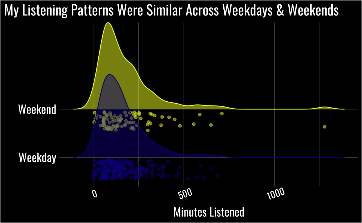
While we didn’t conduct a formal test1 based on visuals alone the distributions and raw data look pretty similar on weekdays vs. weekends.
Conclusion
There’s so much more we could do with this data, and I will in future posts! I’d also encourage you to request your own data, use this code, and see what your listening patterns look like.
Feel free to tweet any visualization you make at me, and good luck!
If you’re interested in doing a more formal test I’d check out the Robust Bayesian Estimation section of this post https://mvuorre.github.io/posts/2017-01-02-how-to-compare-two-groups-with-robust-bayesian-estimation-using-r-stan-and-brms/↩︎