I Don’t Wanna Fight No More1
Nothing gets data people up in the morning like a good language war. R vs. Python is one of the more common ones, and I get it. They often serve similar purposes for data science2 and each have definite strengths.3
The good news is at least some data scientists know a little of both languages and could take advantage of both languages’ strengths given the right opportunities. This post will explore how to play to the strengths of R and Python to forecast visitors to Acadia National Park.
Getting Our Environment Set Up
Setting up our environment is at least half the battle. Until recently I was almost exclusively using Google Colab for Python dev because it makes environment setup trivial.4 But to create this blog post I needed R and Python to work within the RStudio IDE on my local machine.5
Luckily the reticulate package allows us to interface with Python from RStudio. They have a great tutorial article on how to connect to your preferred version of Python. There are lots of options for how to sync up RStudio and Python!
I have found it easiest to create a project-specific conda environment using a .yml file once,6 then call that environment with use_condaenv() each time I open the project. Regardless of what technique you use to interface with Python you can use py_config() to double check you’re pointing at the version of Python you want.
library(reticulate)

# Only run this once to create the environment
# conda_create("nps-reticulate-yml", environment = "nps_conda_environment.yml")

use_condaenv("nps-reticulate-yml")

# Commented out so I don't show a lot of info on my computer/paths
# py_config()
Once I set up the environment I start with my Python imports…
import pandas as pd
import numpy as np
import matplotlib.pyplot as plt

from sktime.forecasting.arima import AutoARIMA
from sktime.utils.plotting import plot_series
from sktime.forecasting.model_selection import temporal_train_test_split
from sklearn.model_selection import train_test_split
from sklearn.linear_model import ElasticNet
from sklearn.pipeline import make_pipeline
from sktime.transformations.panel.tsfresh import TSFreshFeatureExtractor
from sktime.datasets import load_arrow_head, load_basic_motions
And then load my R packages.
Load and Tidy Our Data
I’m going to use R to load and tidy the data. I got the data for monthly visitors to Acadia National Park7 since 1979 from the National Parks Service. Their tables are a bit weird and resistant to being pulled via a web scraper like rvest so I ended up downloading the data as a .csv from here - though check this footnote8 for necessary details. I’m using a minimal gt table to show what the tidied data looks like now.9
Show code
| date | visitors |
|---|---|
| 1979-01-01 | 6011 |
| 1979-02-01 | 5243 |
| 1979-03-01 | 11165 |
| 1979-04-01 | 219351 |
| 1979-05-01 | 339416 |
| 1979-06-01 | 543205 |
Visualizing Monthly Visits to Acadia Since 1979
We’re sticking with R for now and creating a few ggplots. Let’s start with the full dataset and see how monthly visitors fluctuate.
Show code
font_add_google(name = "Orbitron",
                family = "orbitron")

showtext::showtext_auto()

acadia %>%
ggplot(aes(date, visitors, color = "#D5552C")) +
  geom_line() +
  theme_dark() +
  labs(x = "",
       y = "# of Visitors",
       title = "Visits to Acadia National Park are Highly Seasonal",
       subtitle = ""
       ) +
  scale_y_continuous(label = comma) +
    theme(plot.background = element_rect(fill = "black"),
        legend.position = "none",
        text = element_text(family = "orbitron", color = "white", size = 11),
        panel.background = element_rect(fill = "black"),
        axis.text = element_text(color = "white"),
        axis.text.x = element_text(angle = 25),
        plot.title.position = "plot")
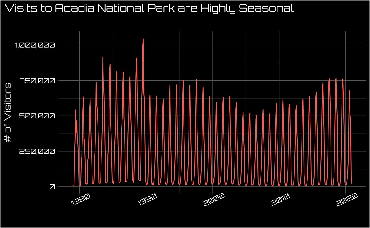
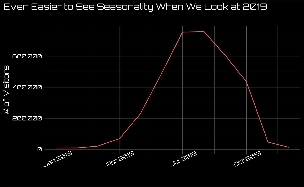
This data looks highly seasonal to say the least! If you’re not familiar with Acadia it’s in the far northeast of the US, so the winters are harsh. We can see this understandable seasonality even more starkly if we zoom in on the most recent non-pandemic-marred year.
Show code
acadia %>%
filter(date > "2018-12-01" & date < "2020-01-01") %>%
ggplot(aes(date, visitors, color = "#D5552C")) +
  geom_line() +
  theme_dark() +
  labs(x = "",
       y = "# of Visitors",
       title = "Even Easier to See Seasonality When We Look at 2019",
       subtitle = ""
       ) +
  scale_y_continuous(label = comma) +
    theme(plot.background = element_rect(fill = "black"),
        legend.position = "none",
        text = element_text(family = "orbitron", color = "white", size = 11),
        panel.background = element_rect(fill = "black"),
        axis.text = element_text(color = "white"),
        axis.text.x = element_text(angle = 25),
        plot.title.position = "plot")
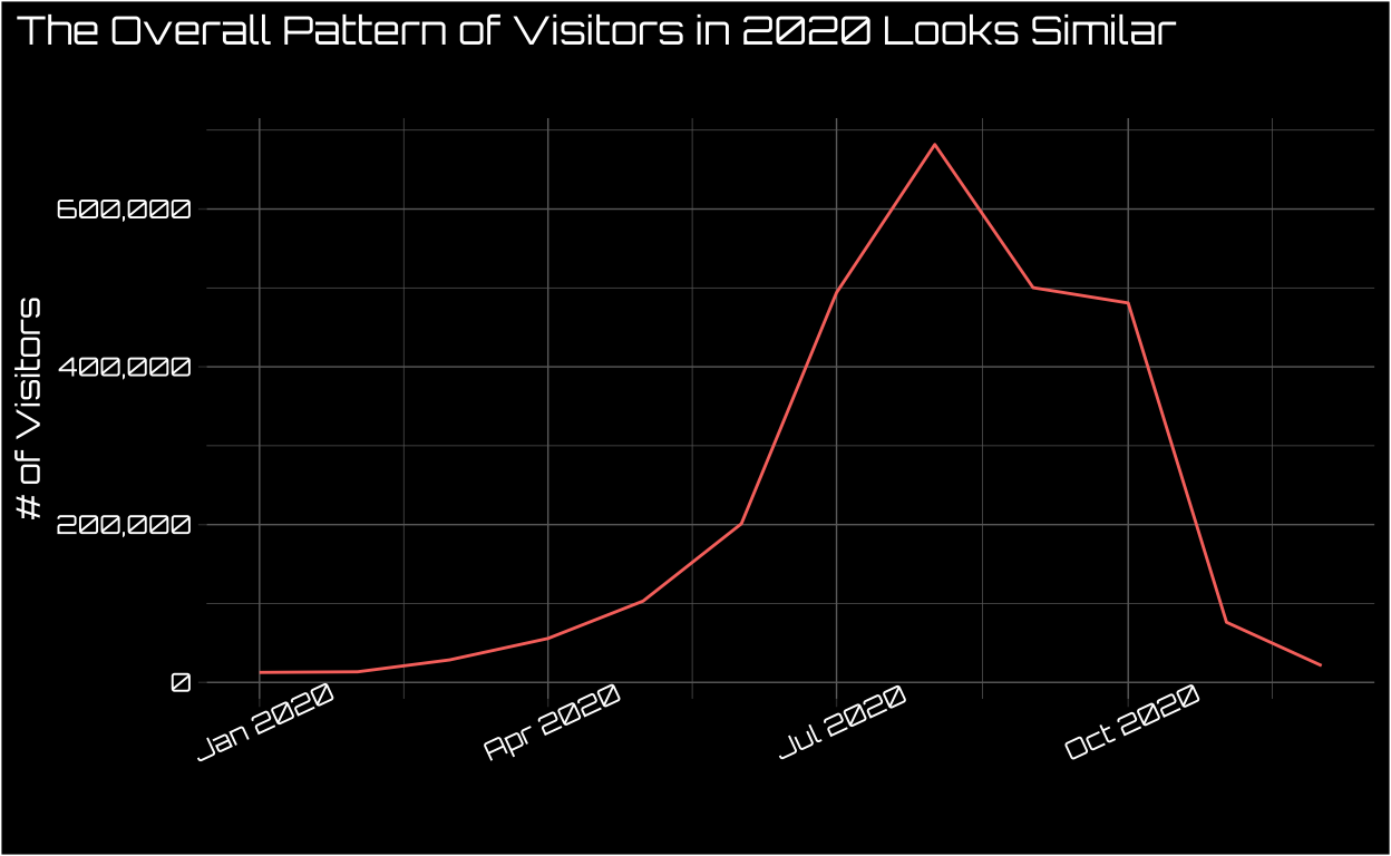
Even 202010 appears to have a similar seasonal pattern.
Show code
acadia %>%
filter(date > "2019-12-01") %>%
ggplot(aes(date, visitors, color = "#D5552C")) +
  geom_line() +
  theme_dark() +
  labs(x = "",
       y = "# of Visitors",
       title = "The Overall Pattern of Visitors in 2020 Looks Similar",
       subtitle = ""
       ) +
  scale_y_continuous(label = comma) +
    theme(plot.background = element_rect(fill = "black"),
        legend.position = "none",
        text = element_text(family = "orbitron", color = "white", size = 11),
        panel.background = element_rect(fill = "black"),
        axis.text = element_text(color = "white"),
        axis.text.x = element_text(angle = 25),
        plot.title.position = "plot")
But what about forecasting visitors beyond where we have data? It’s time to switch to Python.
There are great options for time series forecasting in R11 just like there are good visualization options in Python.12 I’m not claiming I’m making switches between the languages that would be optimal for everyone, so feel free to use your favorite tools for each task!
First, we don’t need to start from scratch! We can call the data we tidied in R, acadia, within the python chunk by calling r.acadia. Reticulate is pretty great. Still, even though we tidied the data in R we need to put some finishing touches on the Pandas DataFrame using Python. If you’re interested in the technical details, check out this footnote.13
Show code
# Separating feature and labels for AutoARIMA

#Note that if we try to modify r.acadia directly that won't work consistently, so save as different object

df = r.acadia

#df.info()

# Converting date to period for later sktime forecast

df["date"] = pd.to_datetime(df["date"]).dt.to_period()

# Setting date to index

df.set_index("date")

# Getting Pandas series we'll use for sktime forecast
visitors
date
1979-01 6011.0
1979-02 5243.0
1979-03 11165.0
1979-04 219351.0
1979-05 339416.0
... ...
2020-08 681746.0
2020-09 500320.0
2020-10 480859.0
2020-11 76251.0
2020-12 21260.0
[504 rows x 1 columns]Show code
y = df.loc[ :, "visitors"]Then we’re going to create a simple Auto ARIMA forecast for the monthly visitors to Acadia over the next year using sktime in Python. This forecast is mostly for demonstration purposes so we aren’t going to any hardcore model comparison or tuning. But we easily could within this framework if we wanted to! If you’re interested in some technical considerations for more complicated time series forecasts check out this footnote.14
Show code
forecaster = AutoARIMA(sp = 12, suppress_warnings= True)
# forecaster

forecaster.fit(y)

# Confidence intervals and predictions
AutoARIMA(sp=12, suppress_warnings=True)Show code
h = 12
predictions_series, conf_int_df = forecaster.predict(
    fh = np.arange(1, h+1),
    return_pred_int= True,
    alpha = 0.05)

# Combine into data frame

ret = pd.concat([y, predictions_series, conf_int_df], axis = 1)
ret.columns = ["value", "prediction","ci_lo","ci_hi"]
Now typically we’d visualize the resulting time series forecast using Python. However, the default-ish plot is pretty disappointing.
Show code
# Visualize time series and my forecast

# Convert index to int64 from range object so they can be plotted together

y.index = list(y.index)

# Creating matplotlib plot showing forecast

plt.style.use("dark_background")

fig = plot_series(
  y,
  predictions_series,
  )
  # conf_int_df["lower"],
  # conf_int_df["upper"])

plt.grid(True)
plt.show()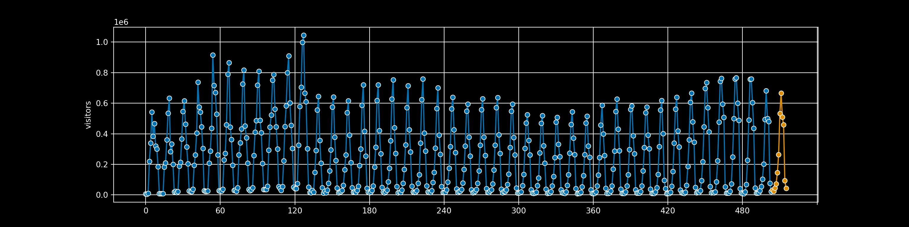
Sure, it could be much worse, but it doesn’t feel like we’re playing to Python’s strengths right now15
Let’s head back to R. We can access the ret object of predictions we created using Python within our R chunk by using py$ret.
From there I can wrangle the data and create a great looking table with gt. I highly recommend checking out this video if you want to walk through how to make better tables.
Show code
as_tibble(py$ret) %>%
  filter(!is.na(prediction)) %>%
  select(value, prediction) %>%
  mutate(value = c("Jan","Feb","Mar","Apr","May","Jun","Jul","Aug","Sept","Oct","Nov","Dec"),
         prediction = as.integer(prediction)) %>%
  bind_cols(acadia %>%
filter(date > "2019-12-01") %>% select(visitors_2020 = visitors)) %>%
  gt(rowname_col = "value") %>%
  tab_header(
    title = md("Using `R` & `Python` Together to Predict Acadia Visitors"),
    subtitle = md("Forecasting Number of Visitors Each Month of **2021**")
  ) %>%
  opt_align_table_header(align = "left") %>%
  cols_label(
    prediction = "Predicted # of Visitors 2021",
    visitors_2020 = "Actual # of Visitors 2020"
  ) %>%
  fmt_number(
    columns = where(is.numeric),
    decimals = 0
  ) %>%
  cols_width(
    value ~ px(120),
    prediction ~ px(240)
  ) %>%
  tab_source_note(
    source_note = md("Data wrangled in `R` and predictions created in `Python`")
  ) %>%
  tab_footnote(
    footnote = md("2021 data not yet available"),
    locations = cells_title()
  ) %>%
  tab_footnote(
    footnote = md("Our predictions capture how seasonal visitors are"),
    locations = cells_stub(rows = "Jul")
  ) %>%
  tab_style(
    locations = cells_body(
      columns = everything(), rows = c("Jul", "Aug", "Sept","Oct")
      ),
    style = list(
      cell_fill(color = "#D5552C"),
      cell_text(color = "black"))
  ) %>%
  tab_stubhead(label = md("Month"))
Using R & Python Together to Predict Acadia Visitors1 |
||
|---|---|---|
| Forecasting Number of Visitors Each Month of 2021 | ||
| Month | Predicted # of Visitors 2021 | Actual # of Visitors 2020 |
| Jan | 32,408 | 12,640 |
| Feb | 23,386 | 13,459 |
| Mar | 46,030 | 28,539 |
| Apr | 73,112 | 55,713 |
| May | 145,726 | 103,120 |
| Jun | 263,247 | 201,156 |
| Jul2 | 533,507 | 493,971 |
| Aug | 666,088 | 681,746 |
| Sept | 509,171 | 500,320 |
| Oct | 458,180 | 480,859 |
| Nov | 93,474 | 76,251 |
| Dec | 42,382 | 21,260 |
Data wrangled in R and predictions created in Python |
||
|
1
2021 data not yet available
2
Our predictions capture how seasonal visitors are
|
||
Conclusion
I had a lot of fun exploring how R and Python could work together on one project! I’m looking forward to further exploring how to bring the best out of both languages together. If you have any ideas for how to do that please tweet them at me. If you’re interested in other projects like this feel free to check out the rest of my blog.
Stuff that isn’t well suited for SQL (Please don’t yell at me)↩︎
R: great statistical packages, awesome community support, etc. Python: more built out support for prediction problems, easier to put into production, etc.↩︎
Read: nonexistent↩︎
You could also check out Quarto which is like RStudio/Jupyter Notebooks but language neutral https://quarto.org/↩︎
You can find resources on how to create this file here: https://docs.conda.io/projects/conda/en/latest/user-guide/tasks/manage-environments.html#create-env-file-manually↩︎
The closest national park to me↩︎
You’ll need to go to “Select Field Name(s)” on the left side of the screen and select “Recreation Visits” from the dropdown menu to reproduce these analyses↩︎
We’ll see a more extensive gt example later in the post↩︎
The last year we have data↩︎
I’m partial to
modeltime↩︎Hello
seabornandplotnine(admittedly a ggplot2 port, though no R depends)↩︎We need to set the date variable to period and set it as the index of the pandas dataframe so we can get sensible output from our sktime forecast later↩︎
I originally conisdered using Blocked Time Series Splits cross-validation a la this example: https://hub.packtpub.com/cross-validation-strategies-for-time-series-forecasting-tutorial/ However, this resource recommends using AIC over cross-validation of any kind, especially in smaller samples https://stats.stackexchange.com/questions/139175/aic-versus-cross-validation-in-time-series-the-small-sample-case I ultimately went with a much simpler forecast to keep this post a manageable length, but you can check out this post that goes into more detail of how to build out an Auto ARIMA forecast https://betterprogramming.pub/using-auto-arima-with-python-e482e322f430 If we want a general purpose example of time series forecasting with sktime you can check out the documentation example here https://www.sktime.org/en/stable/examples/01_forecasting.html#section_1_1 ↩︎
Or at the very least not my strengths within Python!↩︎